
Serai Design Office: Building Architectural Sections with a Focus on Serai One – A Zoomed-In Look
As the design team at Serai, our ambition is to present our structural elements to our customers in the best way possible. Having a rather unusual design for a living space, we used numerous architectural methods to maximize the living space. Finding workarounds to make a 24m2 function as a home made it an even greater challenge to explain the features to our followers and customers.
The reason we are writing this article is to show you how we brought our design pieces together. Let’s look at three sections where we studied the daily use of Serai One.

Clear & simple
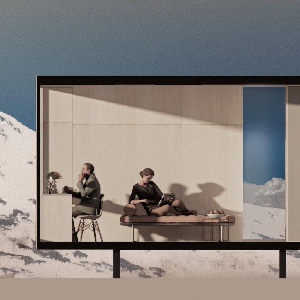
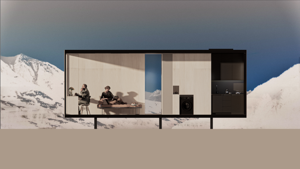
Designing an impactful layout means a clear, minimal, and loud one. That’s why we use a straightforward approach and consistent visual language, showing what everyday life looks like in a Serai One. This visual above was our imagination combining the typical after-work scene of a Zurich couple on a weekday with a weekend getaway layout in the mountains.
Its rather usual that Thomi brings work back home and Andrea, fed up with being left alone almost every workday, sinks herself into a book. Finding solace in an Alpine getaway is easy with large windows looking over the scenery.



Storytelling in a single slice of “home”
Interaction between individuals, parts of the living space, and between living space and exteriors is relatively simple in a section study. Except for the bathroom area, a single slice is enough to show all our place has to offer.
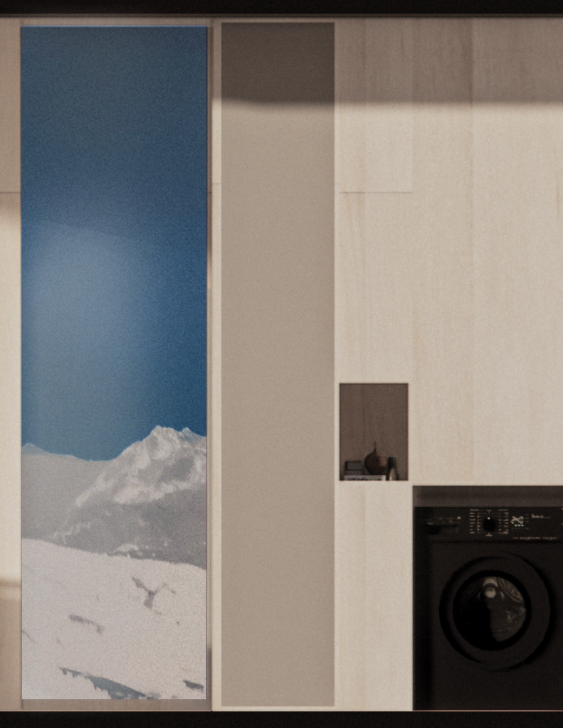
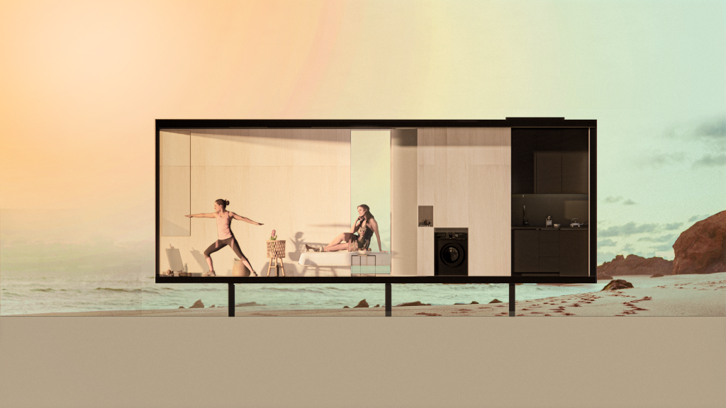
To enhance the aftertaste of this visual, we generously apply shading techniques. The variety of material choices is visibly stronger with the use of regional shading and gradients. Textures are even more highlighted as we chose lighter interior colors.
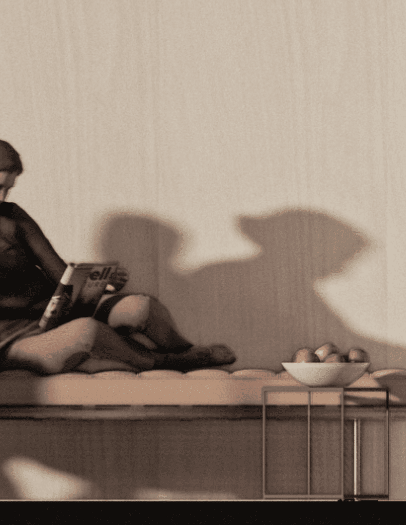
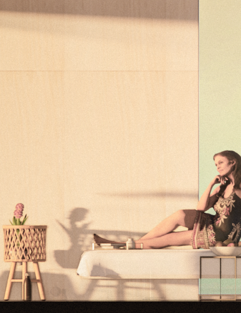
In this scene, it’s an afternoon in Rio. It’s been half a decade since Lucy escaped from the bustling city life of London, first went on her life as a digital nomad, later decided to work remotely for the rest of her life, and settled down on the outskirts of Rio de Janeiro. She met Maria, who works part-time in her locality. The couple decided to spend more time thinking and reflecting and less time zapping through city transport. Locating a space on the seaside, their living space reflects the minimalist living both sought for.


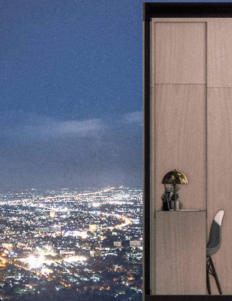
Cityscape at night
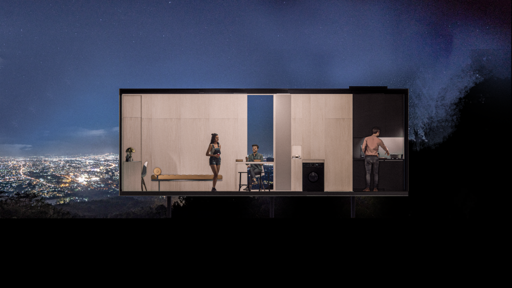
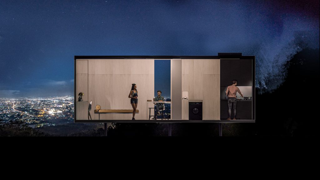
Here our focus shifted from slicing and dicing to telling stories to practice the use of Serai One – inviting friends over for dinner. The key design element of Serai One is to combine multiple uses and spaces into one, and in this case bringing together a kitchen, a dining table, and even the working desk to use simultaneously. This is our unique value proposition, “we do all in one”.
Mike throwing a welcome back home party for Josh, his best friend on a starry night in Los Angeles is not a rare event. Having three persons comfortably living in 24m2 isn’t! Cook, serving, eating, enjoy the moment with ambient sounds is the scenario we dreamed of. What we seek to see is the mind-blowing view through the 3x3m window and the glitter of city lights.

Three sections and their stories were our first attempt to share our imagination with our customers. While designing Serai One, we start by thinking about where and how it will deploy, followed by why it’s there in the first place. Our designs (including upcoming ones, so stay tuned!) always include a technique to immerse the resident in her surroundings – and in the case of One, the “window”. Please note that we do not deploy a television in any of our products, not even as an option.


